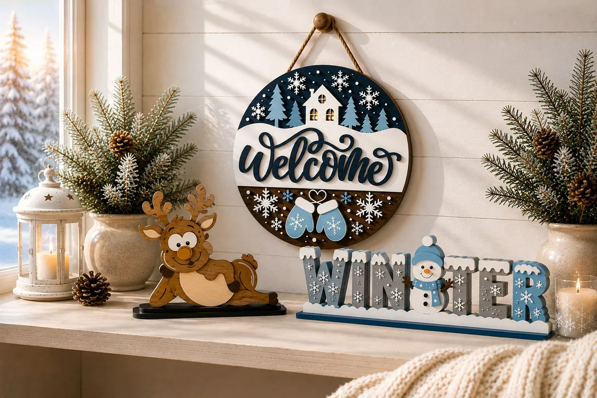
Winter Sign SVG: 29 Laser Cut Templates, Layer by Layer
A winter sign has a longer season than a Christmas one. The tree comes down on the sixth of January and everything on it goes into a box. A snowflake, a pair of mittens and the word WINTER stay out until the snow does. In most of the country that means another eight weeks of a door that still looks decorated.
That is the whole practical case for cutting winter rather than Christmas. It is also why these files are worth a look, even if you have already cut a tree’s worth of ornaments.
Below are twenty-nine of them. Twenty-one hang on a door or a window, two are characters holding a board, and two are words that are themselves the object. One figure lies on a shelf, two stand on their own base, and one small face doubles as a fridge magnet. For each, what the maker states, and what the photographs actually show — which is not always the same thing.
Short answer: for a door that stays dressed after Christmas, take a round with the words on a band or on bare wood, such as Snuggle Up Gnomies or Warm Winter Wishes. For a shelf, the WINTER word or the lying deer stand on their own. To sell, the six-sign blank gives six products off one cut list. The eight layouts side by side: jump to the comparison table.
Details are based on the designers’ product descriptions on Creative Fabrica and on the photographs.
Rounds for the door
Fifteen of these hang as a circle, from makers who never spoke to each other. What they share is one problem: where to put the words so they still read from the pavement. The answers, arrived at separately, come down to a handful of moves you can steal.
Snuggle Up Gnomies
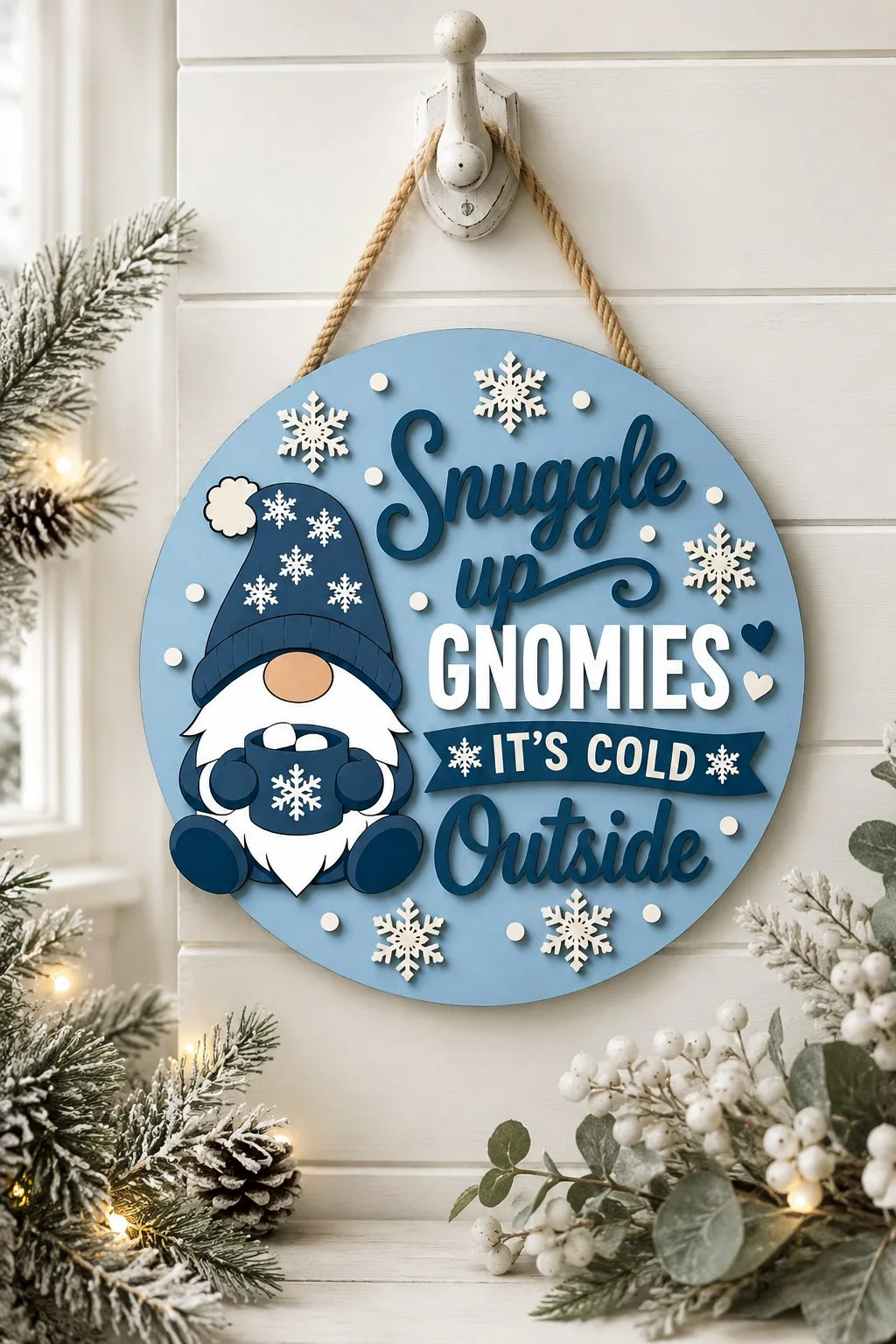
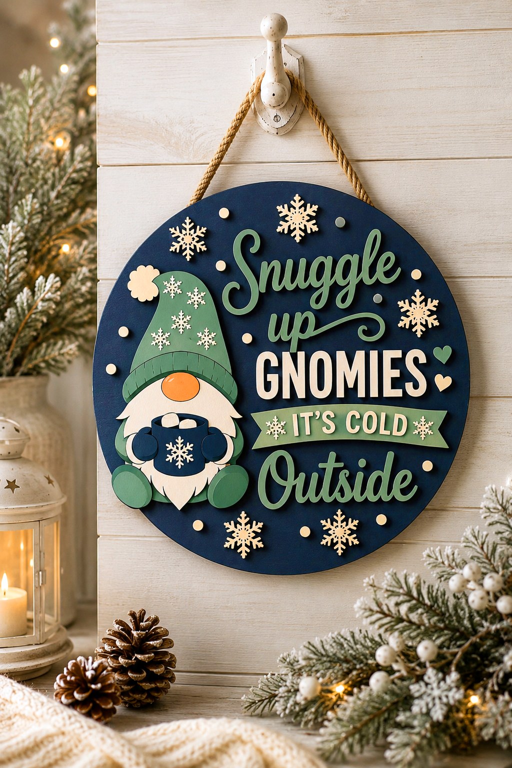
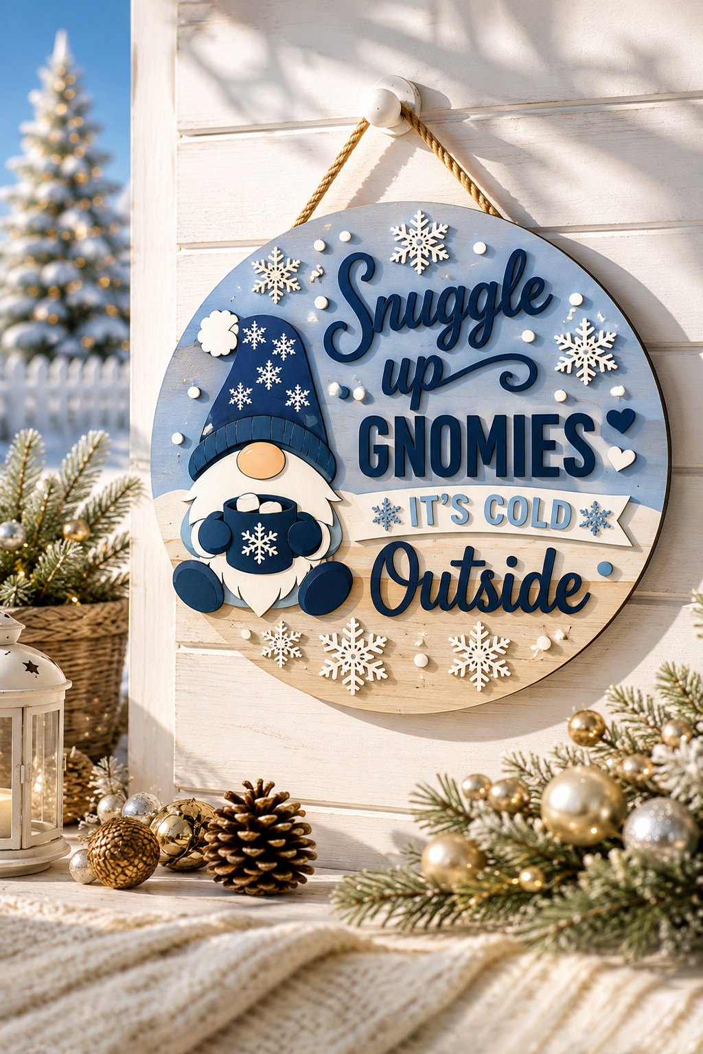
A pale blue circle on a rope. The gnome takes the left third: a navy hat dusted with snowflakes, a round wooden nose, a white beard, blue mittens around a mug with a snowflake on the side. Words take the right two thirds entirely.
Look at how those words sit, because this is the most instructive sign in the round-up. There are four lines and four different treatments:
- Snuggle — a flowing script, dark on the pale background
- up — the same script, smaller, tucked into the curl of the letter above
- GNOMIES — a heavy sans-serif, cut in white, sitting on nothing but the blue
- IT’S COLD — white on a navy banner with notched ends
- Outside — back to the script, largest of all
Four typefaces in one object should be a mess. It is not, and the reason is that each one has its own background layer. The banner separates the third line from the second. The white block letters are heavy enough to hold their own against blue. The script lines are the only ones that touch the raw blank, and they are dark, so they read.
Copy this and you can put any phrase on any round without it turning into soup. Do not copy the number four; copy the rule, which is that a change of typeface needs a change of ground.
Snowflakes and small dots fill the empty edge of the circle. They are separate overlays and they are not decoration in the idle sense — without them the circle reads as half-empty on the right.
One round, three colourways
The three photographs show the same round in three colourways. One is pale blue with navy lettering, one is navy with green, and in the third the circle is split, blue at the top and bare wood along the bottom. Look at what does not change. In all three the banner sits at a different value from the ground behind it, and in all three the script is the only element allowed to touch the blank.
The third one is the interesting one, because it breaks the pattern and still works. On the first two, GNOMIES is white and is the lightest thing on the sign. Here the same word is navy on a pale blue field, so the polarity flips. The line still reads first. That is the proof that the layout rests on contrast rather than on any particular colour. Light on dark or dark on light, either way works, so long as the gap is wide. Swap every colour you like and the reading order survives. Run that test on your own layout before you cut it.
Materials: wood, MDF, plywood or acrylic. Thickness not stated. Formats: AI, EPS, SVG, DXF, PDF, DWG. The maker names craft fairs outright among the uses.
Four Rounds in Blue and White
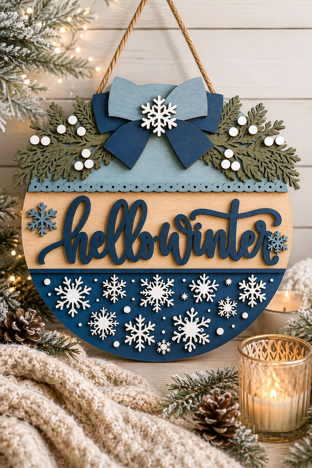
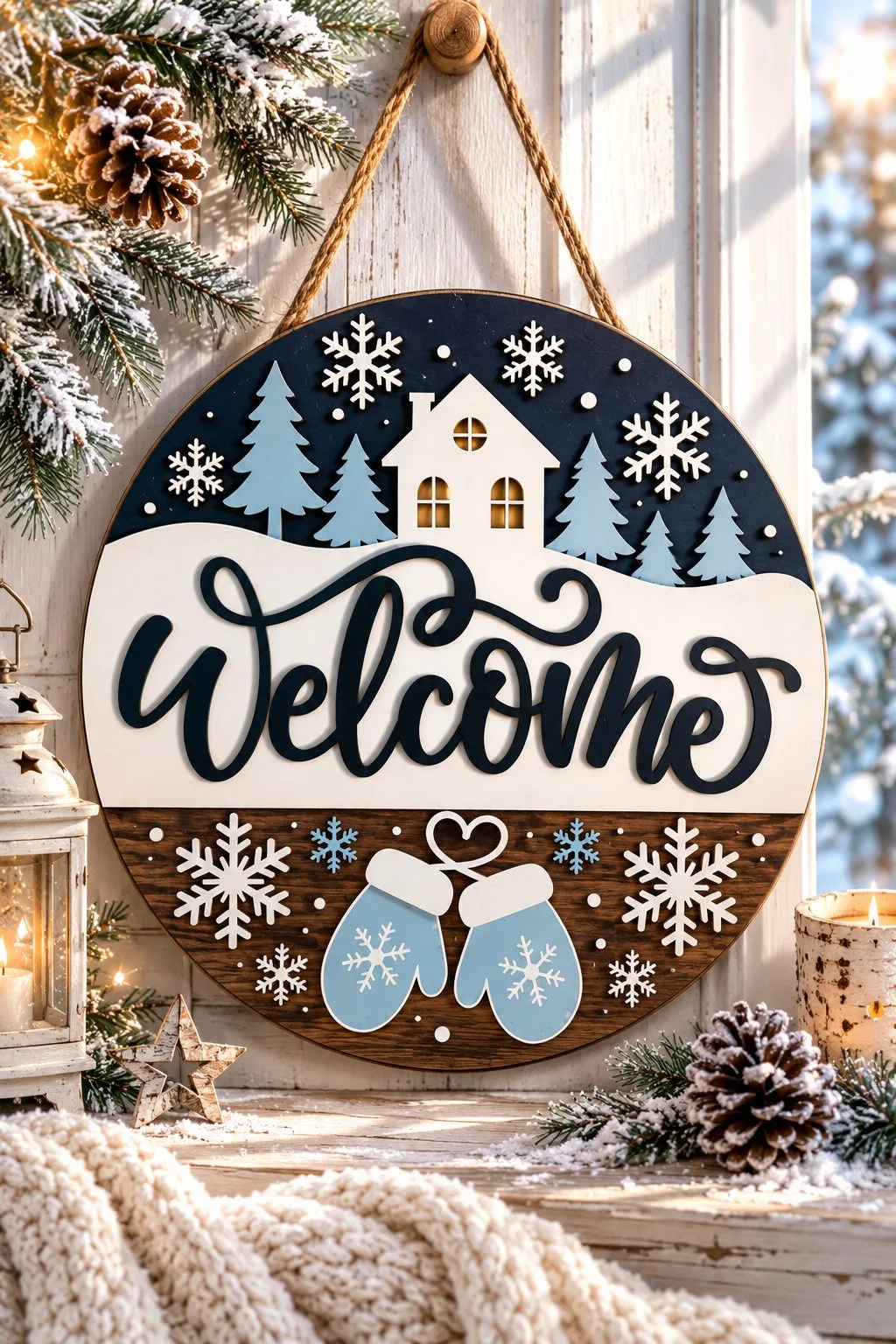
Four makers, one palette — pale wood, navy, white — and four goes at the same question: where do the words live. The first two answer it the same way, and both answer it with no character standing in the middle.
Hello Winter has no character at all. A layered bow in two blues with a white snowflake at the knot sits in the middle, with cedar sprigs and white berries fanning to both sides. Snowflakes in three sizes, with small dots between them, fill the whole lower half of the circle. The greeting is one continuous script with both words joined, and it sits on a pale wooden band across the middle.
The Welcome sign solves it with a scene instead of a bouquet. The circle splits into three horizontal bands. At the top is a night sky with a house and a stand of fir trees. A cream snowdrift carrying the script runs through the middle. At the bottom, a strip of dark wood holds snowflakes and a pair of pale blue mittens, joined by a string bent into a heart. The house windows are a warm-toned layer showing through the front, so it reads as lit with nothing electrical in the build.
Both put the script on a pale band rather than on the busy part of the circle. That is the whole reason either one reads from the end of a path. The Welcome sign shows you the cost of the alternative directly. Above the script, the sky band is full of branches and snowflakes, and lettering laid over it would fight every one of them.
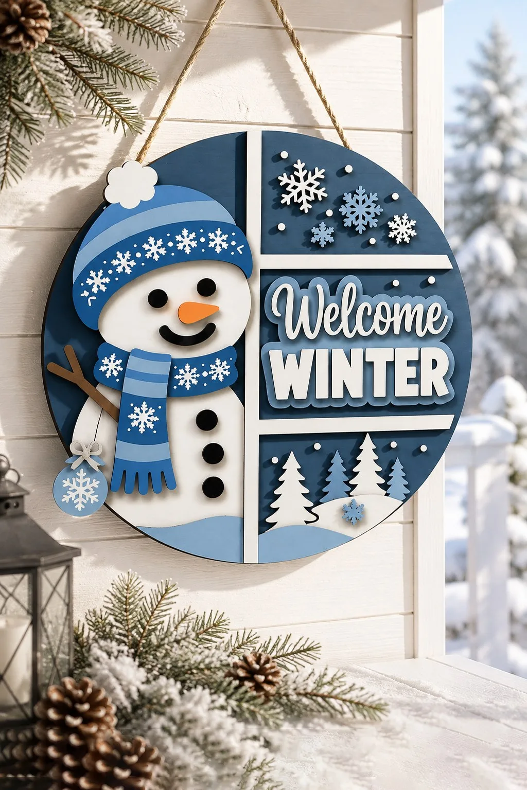
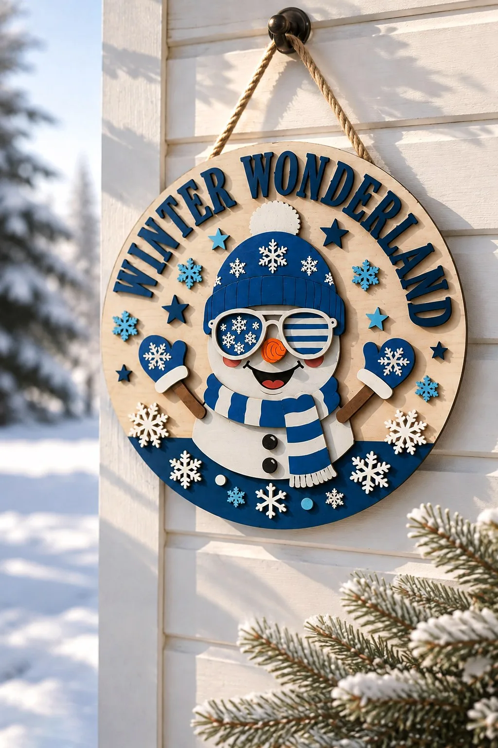
The other two put a snowman in the middle of the circle and then have to find room for the words anyway. They go in opposite directions.
Two rounds with a snowman in the middle
Welcome Winter takes the bluntest route on the page: it cuts the circle straight down the middle. The snowman on the left wears a knit hat and a striped scarf, with mittens dangling below him on strings. On the right is a navy panel carrying Welcome in script over WINTER in block capitals, with a row of snowy pines under the words. No plate, no banner, no clever nesting. One hard vertical edge, and each half gets a whole side to itself.
Winter Wonderland refuses to give the words a panel at all and bends them around the rim instead. WINTER WONDERLAND runs as an arc along the top edge in navy block capitals — sixteen separate applied letters, each turned to its own tangent. None of that is obvious once the parts come off the machine. So cut a paper proof of the arc and glue on top of it, the same as with the gingerbread round further down.
Losing the panel buys the whole middle of the circle for the snowman, and he is the most detailed one here. He wears a blue knit beanie, ribbed at the brim, with snowflakes over the crown and a white pompom. His sunglasses have one lens patterned in snowflakes and the other in navy stripes. He also has a spiral carrot nose, two pink cheeks and an open grin. A blue and white striped scarf with a fringed end sits at his neck, above two black buttons. Bare wooden stick arms end in mittens with a snowflake on each. A navy drift closes the bottom third of the circle and carries white and pale blue snowflakes. Stars in two blues dot the empty wood on either side of the letters.
Why the bare-wood round holds together
Why does it hold together with no field under the words? The letters are navy and thick, and the plywood behind them stays completely empty. It is the same trick as the bare-wood pair below, read from the other end. There the letters are white on wood and here they are navy, but either way nobody touches the ground.
One thing this file has and nothing else on the page does: the photograph shows how it hangs. A twisted rope through the top of the circle, over a black wall hook. Everywhere else, you work the fixing out yourself.
Put the four side by side and the rule stops being a matter of taste. A stripe, a band, a half, or bare wood and nothing else: the shape of the ground does not matter, only that the words get one to themselves.
None of the four has a tree, red or holly on it. That is what earns them a February when the rest of the box has gone back in the loft. Winter Wonderland’s maker does list Christmas décor among the uses, but nothing in the design itself ties it to December.
The file lists differ. Hello Winter ships SVG, DXF, EPS, AI, PDF and PNG; Welcome Winter the same six; the snowy house sign and Winter Wonderland ship DWG in place of PNG. Two of the four have no DWG at all, so check before you commit if your workflow needs it.
A Hat and Mittens Instead of a Character
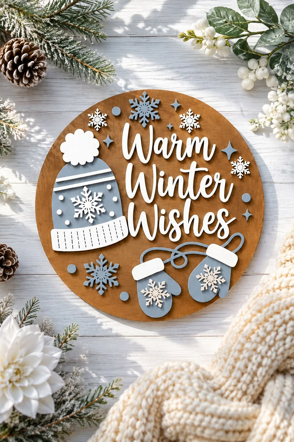
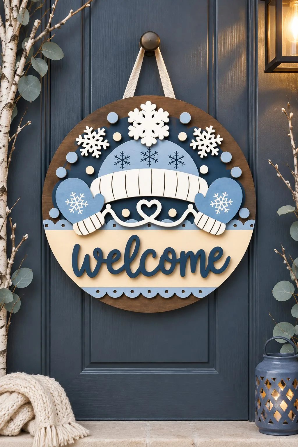
Most of the rounds above paint a field for the words to sit on. Warm Winter Wishes does not, and neither did Winter Wonderland. The ground is the plywood itself, left bare, and the design is what goes on top of it.
Warm Winter Wishes has no character at all. A knit beanie with a cable pattern and a white pompom sits in the upper left. Below it are three lines of white script and a pair of blue mittens joined by a string. The letters lie straight on the wood. It works because they are white and thick, and because there is nothing else in the middle of the circle to compete with them. Take away either condition and this sign would need a plate like all the others.
Bare wood is also the cheaper build. No painted background layer sits here, so the stack is shallower and the cut list shorter than on any of the painted rounds above.
The maker gives neither a thickness nor a diameter for this one.
A second round with mittens
No snowman and no gnome. A knitted hat with a snowflake pompom tops the round. A blue mitten sits on each side, and Welcome runs across the bottom in script on a navy band.
It is the simplest way to make a winter sign without a character. That is exactly why it suits more doors: anywhere a cartoon snowman would feel like too much, a pair of mittens still reads as winter. The palette is soft blue, cream and dark navy. However, the construction does not depend on it: light pieces on a dark field, the same rule as everything else on this page.
Formats: SVG, AI, DXF, PDF, EPS, DWG. Thickness not stated.
Two Snowmen, Two Ways
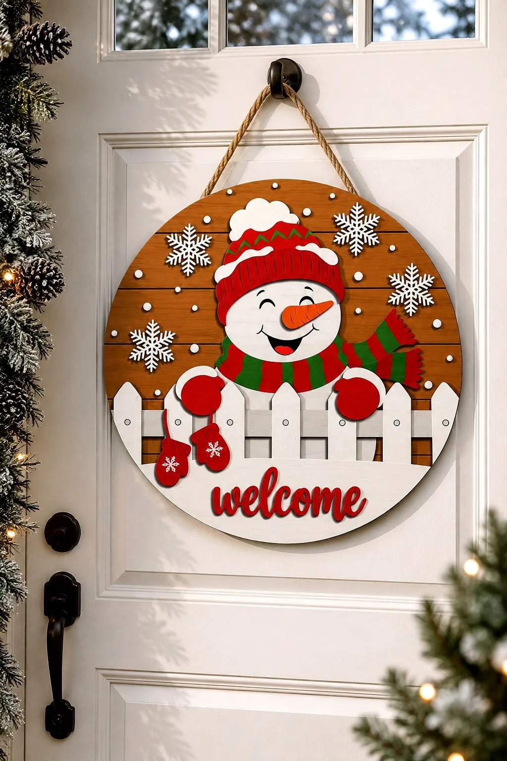
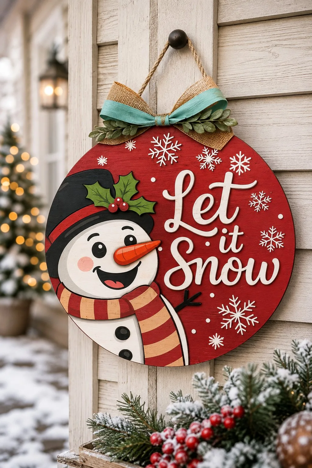
The same character, the same round, and two opposite decisions about how much of him to show.
The smiling snowman keeps the whole figure and gives it a device: a white picket fence straight across the middle. The fence does three jobs at once. It hides the join where the snowman ends, and it gives the red script below a clean strip of bare wood to sit on. The fence also holds two red mittens that would otherwise have nowhere to hang. One part, three problems. Everything sits on plain plywood — no painted background anywhere.
Let it Snow goes the other way and lets the circle cut the character. The head fills the left half and runs off the edge. It has coal eyes with brows, a carrot nose with the rings drawn in, pink cheeks and an open grin with a red tongue. A black top hat with a red band and a sprig of holly finishes it. Below it a red and yellow striped scarf, a white body with two black buttons, one thin stick arm. The greeting sits to the right in cream script over three lines, on a red field with snowflakes scattered through it.
Cropping the character
Cropping a character at the edge is a deliberate choice with a cost. You lose the shape of the whole figure, and you gain scale. Put these two on a door, and people read the cropped one from the pavement. They look at the fenced one once they are on the step. Neither is better. Decide which distance you are cutting for, then draw the figure at the size that distance needs.
The fenced snowman is one of the six files on this page whose maker names a thickness — 3 to 6 mm plywood, MDF or acrylic — and it states one design in the archive.
Two honest warnings about the Let it Snow round. The burlap and teal bow in the photograph is fabric, bought separately; it is not in the file. And that archive holds SVG and PNG only — no DXF, no EPS. If you work in LightBurn or on a CNC you will be converting before you cut, and that is the one thing on this page that could waste your evening. The PNG, the maker points out, is there for sublimation, so the same artwork prints as well as cuts. The slug says bundle and the preview shows several signs, but the listing gives no number of designs anywhere, so treat it as the one you can see.
Two Rounds Behind a Snowdrift
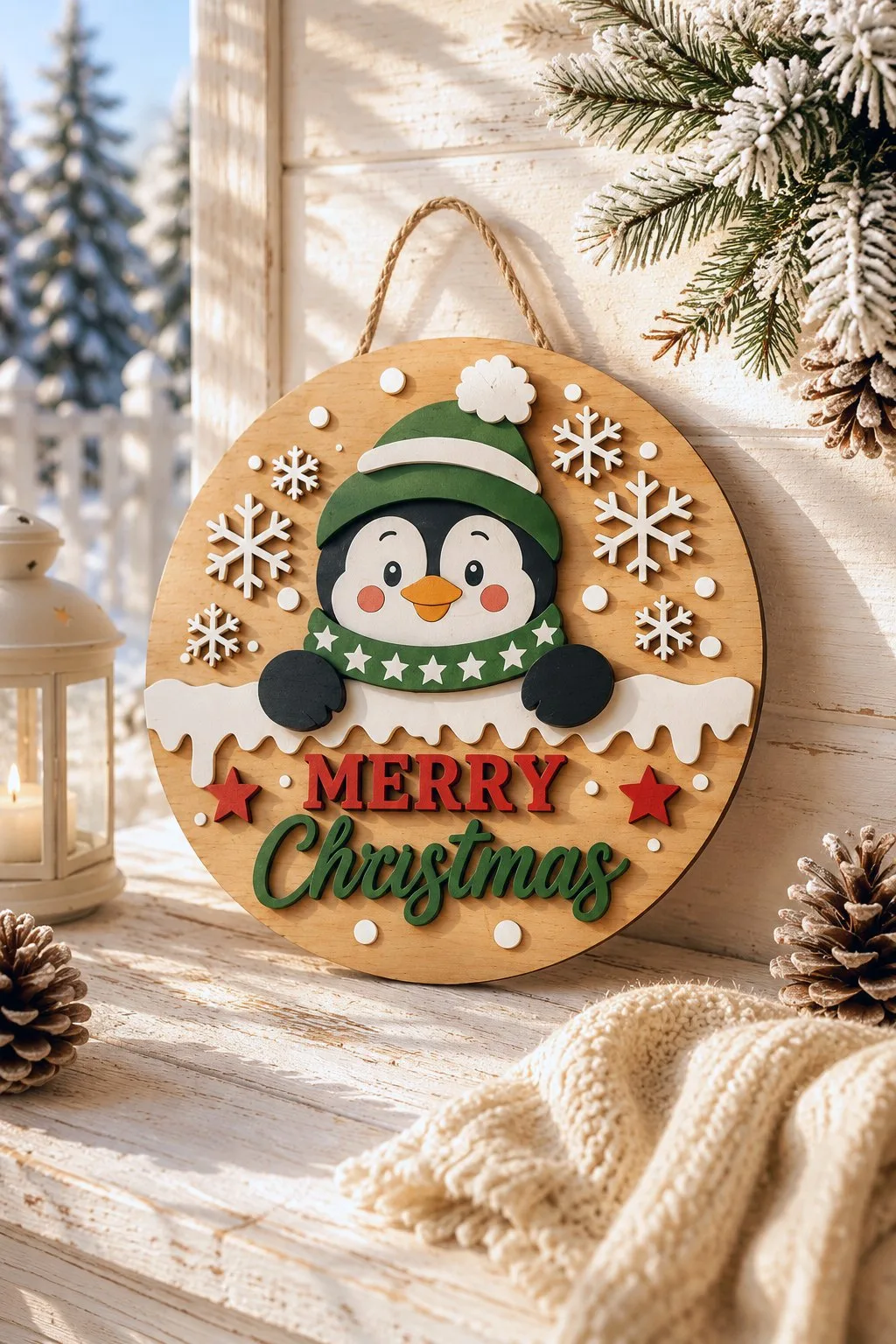
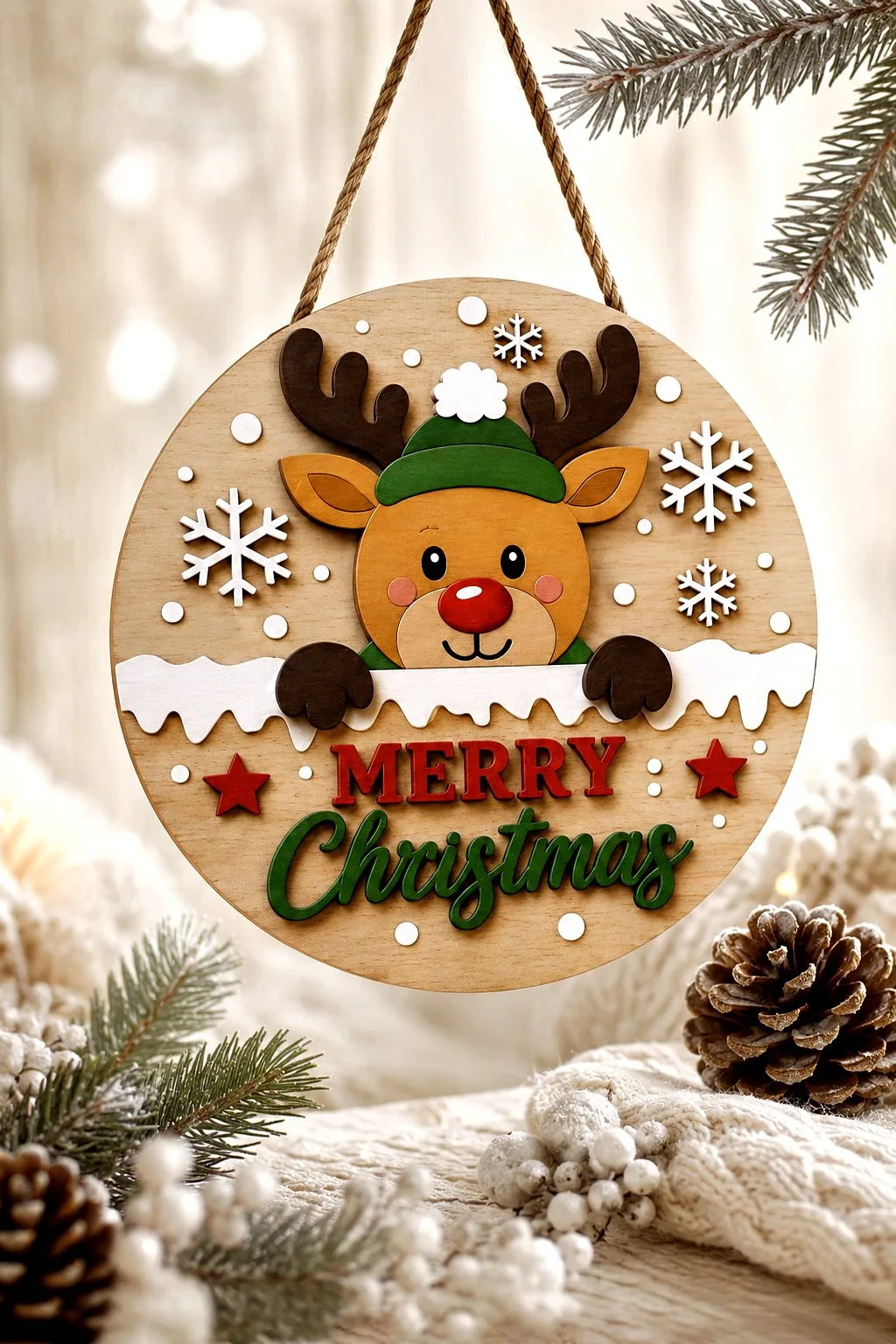
Most of the rounds on this page give the words a band. These two give them a horizon, and they are worth setting side by side: two makers, the same part, the same job done twice over.
The penguin round. A white drift with a wavy top edge runs straight across a pale plywood circle and cuts it in two. Above the line sits a penguin with a black head, a white mask around the eyes, an orange beak and pink cheeks. He wears a green hat with a white turn-up and pompom, and a green scarf with white stars. Below the line: MERRY in raised red letters and Christmas in green script, with a small red star at either end. Snowflakes in three sizes fill the wood around the head.
The drift is doing three jobs, and this is the part worth stealing for your own template. It hides the bottom edge of the penguin, so you never draw his body. It gives the lettering an empty field with nothing behind it. And the two black wings laid on top of the drift turn the whole thing into a pose — the bird is leaning on it. One wavy part, and the sign has depth, clean type and a character all at once.
Note the name on that one. The maker calls it a Welcome sign; the sign says Merry Christmas. Go by the picture, not the title, and if you want the word Welcome you will be redrawing it yourself.
The reindeer round
The reindeer round takes the same part and pushes it further. The drift here is not a smooth wave but a ragged snow ledge with icicle drips along its underside, and it runs the full width of the circle, edge to edge. The deer looks over it in a green beanie with a white pompom, with dark antlers spreading above the ears, a red nose and pink cheeks. His two dark hooves rest on top of the ledge, exactly as the penguin’s wings do. Below: MERRY in red capitals with a red star on either side, Christmas in green script under it, and small white dots scattered through the bare wood.
Set them side by side and you can see what the ledge is for. Neither animal has a body. Both stop at the drift, and the part that would be hardest to draw — shoulders, chest, the join between head and torso — is simply never cut. The maker gets a character with three pieces and a strip of white, and the viewer’s eye fills in the rest unprompted. That is the cheapest depth on this page, and the reason to copy it: your character needs a head, two paws and something to lean on.
Which drift to choose
The differences are small but they matter if you are choosing one. The penguin’s drift is a single smooth wave and sits mid-circle, so the lettering gets the whole lower half. The reindeer’s ledge is lower and more detailed, which leaves the words a shallower field but gives the top two thirds to those antlers. Busy characters want the low ledge; long greetings want the high one.
Both use applied layers in their own colours with almost no engraving. They are paint-and-stack builds rather than burns. Both ship SVG, AI, DXF, EPS, PDF and DWG, and neither maker states a thickness or a diameter. The reindeer file names the widest machine list on the page: Glowforge, xTool, LightBurn, OMTech, Thunder Laser, Aeon, Cricut, Silhouette Designer Edition and CNC routers.
One Blank, Six Signs
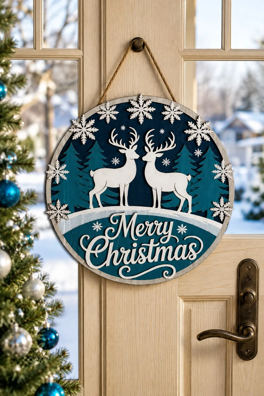
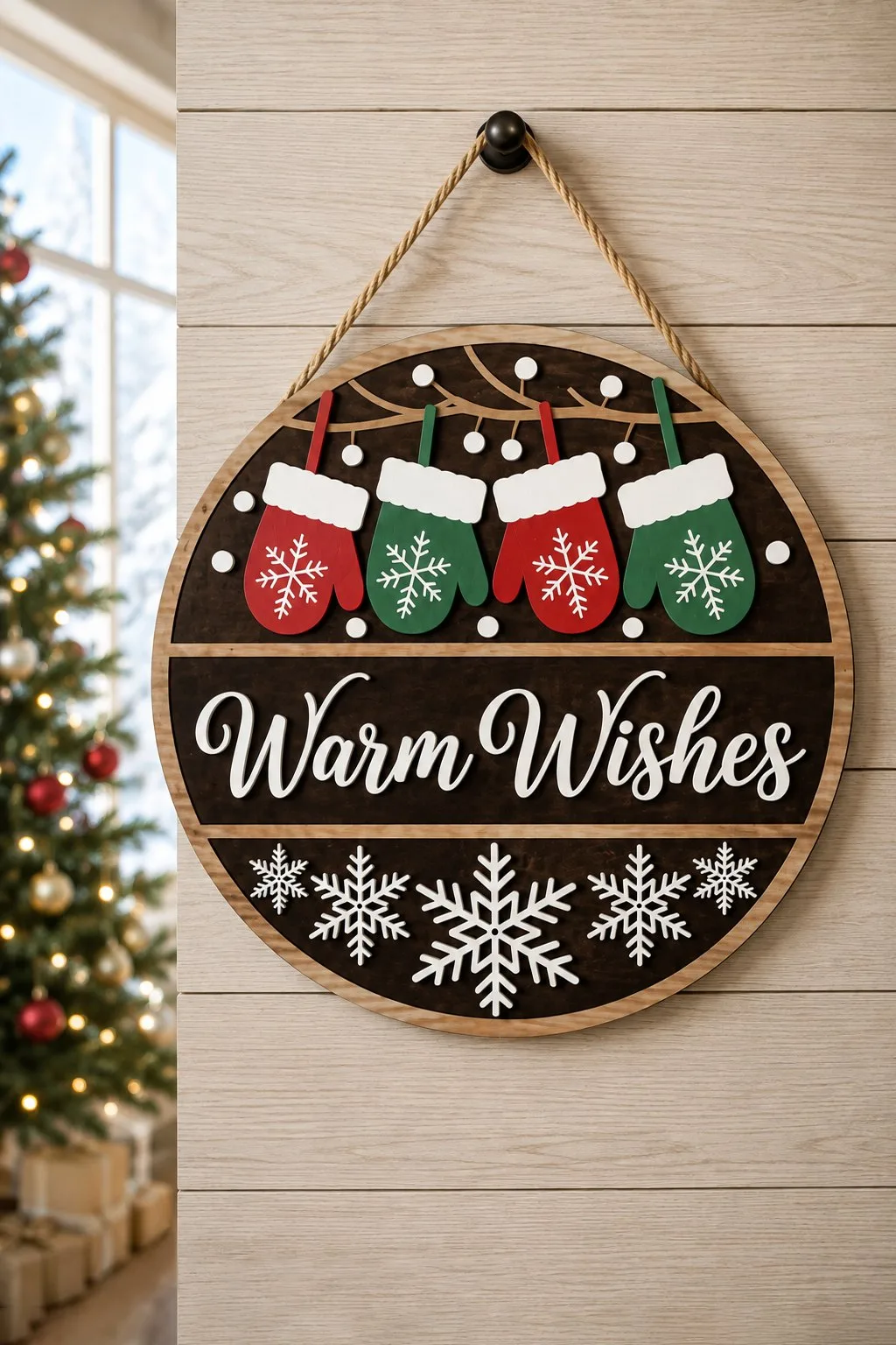
Everything else on this page is one sign. This is a template for six, and the two photographed here show exactly what changes between them and what does not.
Both share a build: a wide outer rim in bare wood, a dark field inset within it, applied script and an applied scene. The reindeer sign has a navy field with two white deer facing each other, a row of teal firs behind them at different heights, and big white snowflakes above. Some of those snowflakes ride up over the rim and sit on the edge. Merry Christmas runs in white script along a pale drift at the foot. The mittens sign has a dark brown field split into three horizontal strips. A branch across the top has four mittens hanging from it, two red and two green, each with a white cuff and a snowflake. Warm Wishes in white script through the middle; a row of five snowflakes along the bottom.
The rim is the whole trick. It is the same ring every time, so the cut list, the diameter and the hanging hole never change — only the filling. If you cut to sell, that is six products off one setup, and the maker allows selling the finished pieces outright.
Why the rim matters
The snowflakes climbing onto the rim are worth a second look. A perfect circle reads as a blank; one detail crossing the edge makes it read as a scene. It costs nothing in the file and it is the difference between the two signs on this page you would look at twice.
This maker is also the most forthcoming on the page about the build: 3 mm (1/8″) plywood, MDF or acrylic, acrylic paint, stain or markers to finish, wood glue to assemble. Six designs are stated, across three greetings — the third, Cookie Tasters Welcome, is in the folder but not in either photograph. Formats per design: SVG, DXF, EPS, DWG, AI, PDF.
A Gnome Behind a Picket Fence
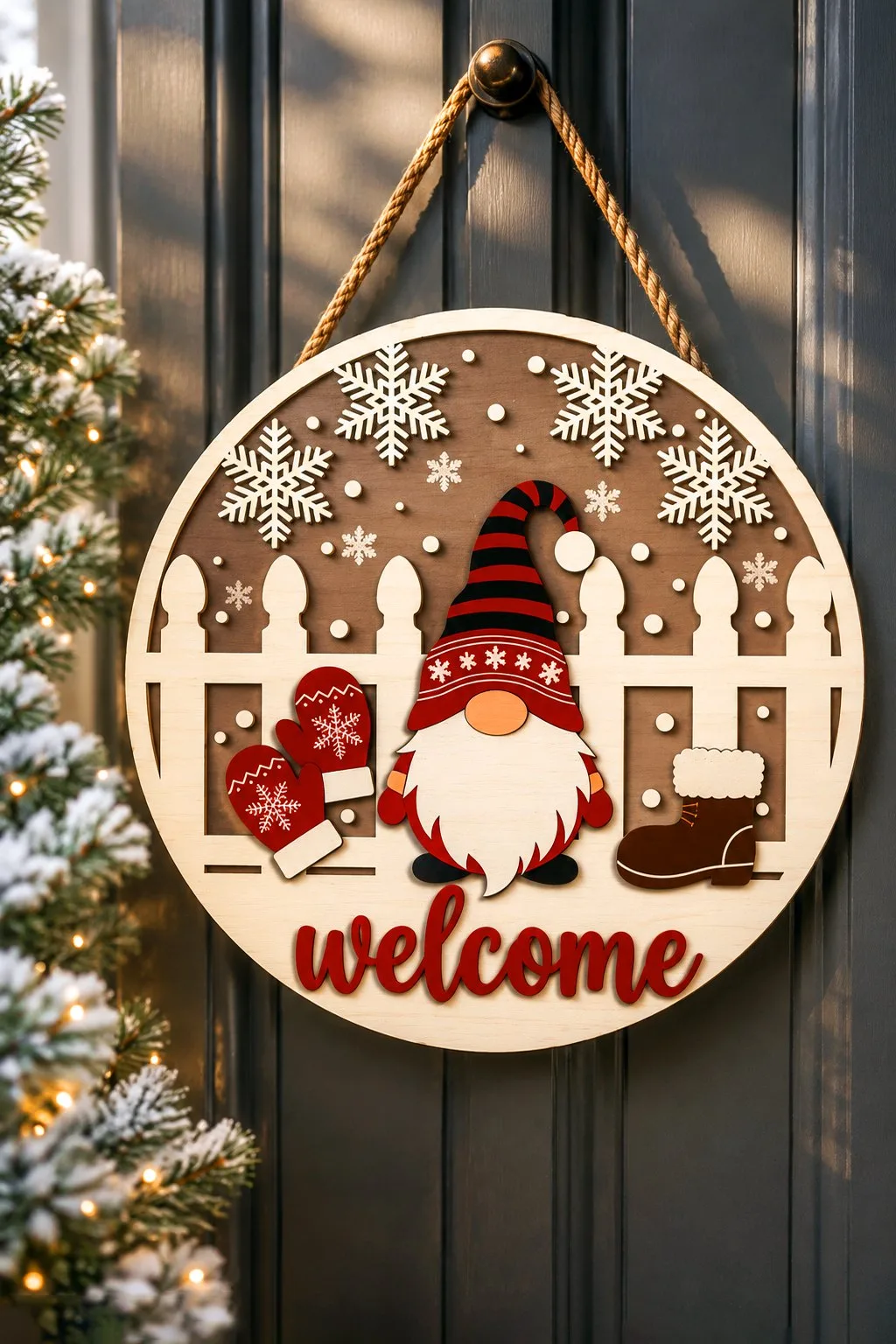
Same horizon idea as the penguin, different part: here it is a white picket fence, wide boards with shaped tops and gaps between them that show the dark field behind.
Above it stands a gnome. He has a black and red striped hat with a bent tip, a red turn-up dusted with snowflakes, a round wooden nose, a long white beard with a wavy edge, red mittens either side and small black feet. On the fence itself, two red mittens to the left and a brown boot with a white fur cuff to the right, sitting on the rail like things left out to dry. Below, welcome in large red script, and the letters overrun the bottom of the fence rather than stopping politely at it.
The gaps between the boards are what make this better than a plain stripe. A solid band would seal the circle into two halves. The fence lets the dark field show through in slots, so the sign still reads as one piece with a fence standing in it.
This is also the only sign here photographed on a dark door. It makes a point the rest of the page cannot: pale plywood against dark paint is the strongest contrast on this entire list. If your own front door is charcoal or navy, plan the sign the other way round from everything you have seen — light blank, dark surround.
Thickness is given: 3 to 6 mm plywood, MDF or acrylic. The maker also offers an engraved version as an alternative to the layered one. One design, stated. Formats: SVG, AI, EPS, PDF, DXF, DWG.
Three Snowmen and a Mug of Cocoa
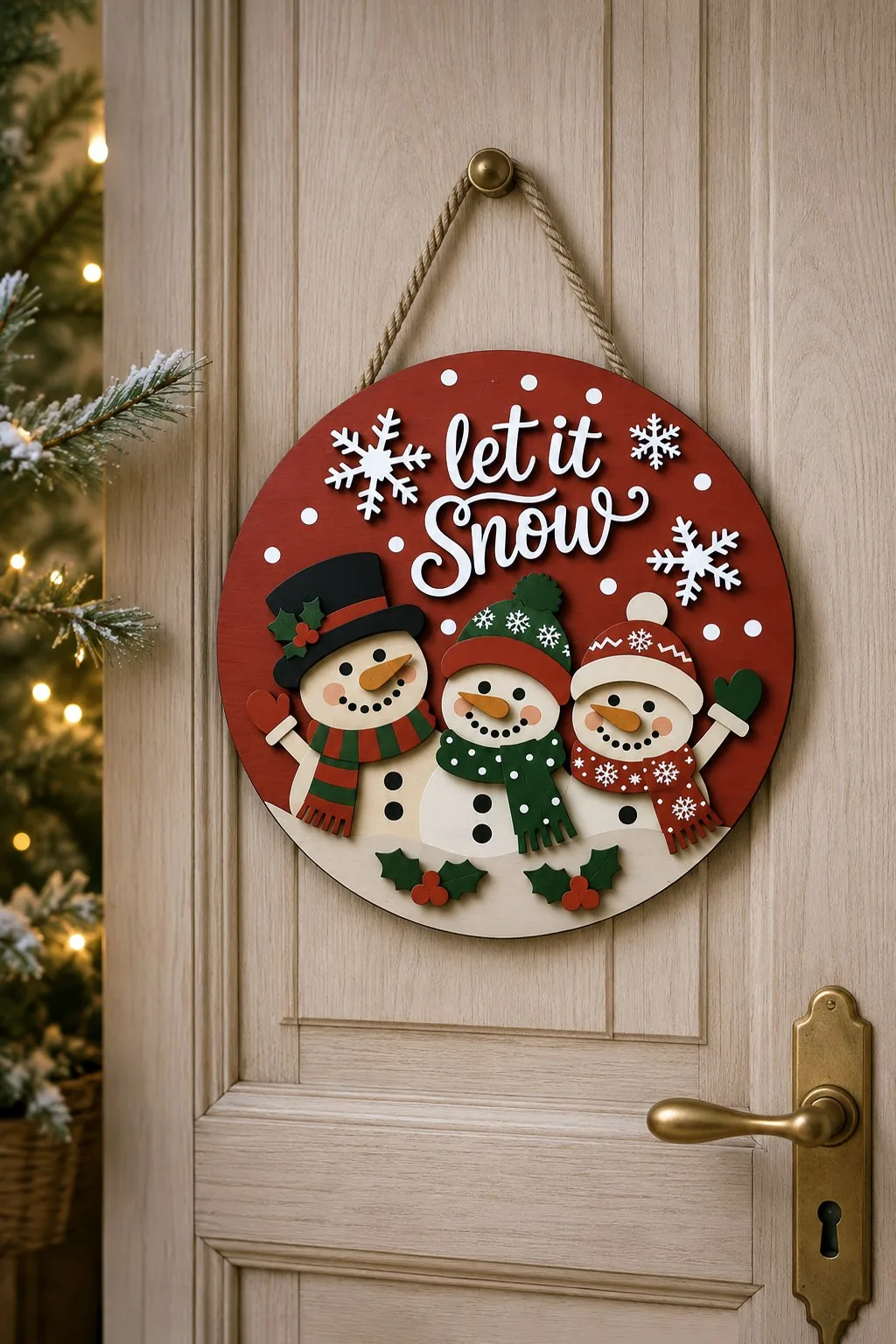
Let It Snow, with three snowmen lined up from tallest to smallest inside one circle. On the left, a black top hat with holly and a red and green striped scarf. In the middle, a green snowflake hat and a spotted scarf. On the right, a red bobble hat. The carrot noses are separate orange pieces, the two outer snowmen wave a mitten, and the lettering runs in white across a deep red top.
The bottom of the circle is a white snowdrift with a wavy edge, the same trick as the rounds behind a snowdrift above. That drift splits the circle, so three figures fit without making the sign any bigger. The maker names the palette outright (red, green, black and white), calls the build beginner friendly and, unusually, states the material: 3 mm (1/8 inch) plywood, MDF, basswood or acrylic. Files come as SVG, DXF, EPS, AI, PDF and DWG.
Hello Winter with a mug of cocoa
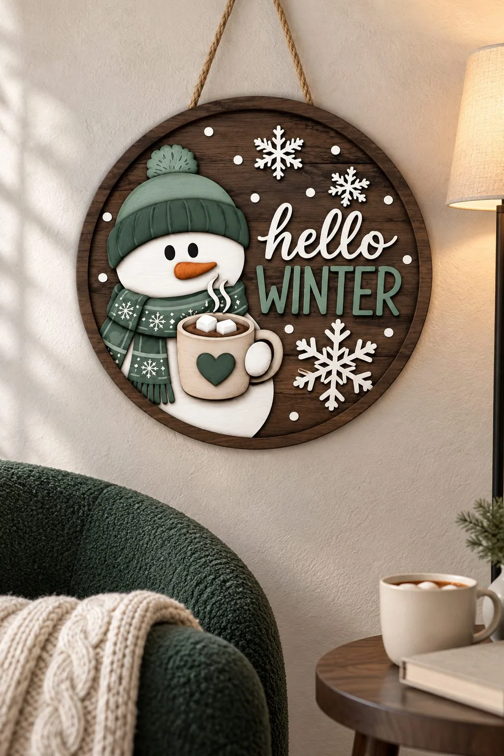
A dark wooden round on a rope. The snowman takes the left side: a green knit hat with a pompom, a matching scarf, and a mug of hot cocoa with marshmallows and a heart on the side. The right side holds two lines — hello in a white script and WINTER in tall muted-green capitals — with snowflakes around the edge.
It solves the same problem as the gnomes above in a quieter way. Two lines, two typefaces, and each one gets its own treatment: the script is white against dark wood, and the capitals match the hat. The contrast lives in the ground rather than in the letters: the circle is dark, and everything that has to read is light or coloured.
The reason to cut it is the one this whole page rests on. There is no tree, no Santa and no Merry anywhere on it, so it stays on the door from December to the end of February.
Formats: SVG, AI, EPS, DXF, DWG, PDF. Thickness not stated.
The same house, twice
Home Sweet Home, Two Ways
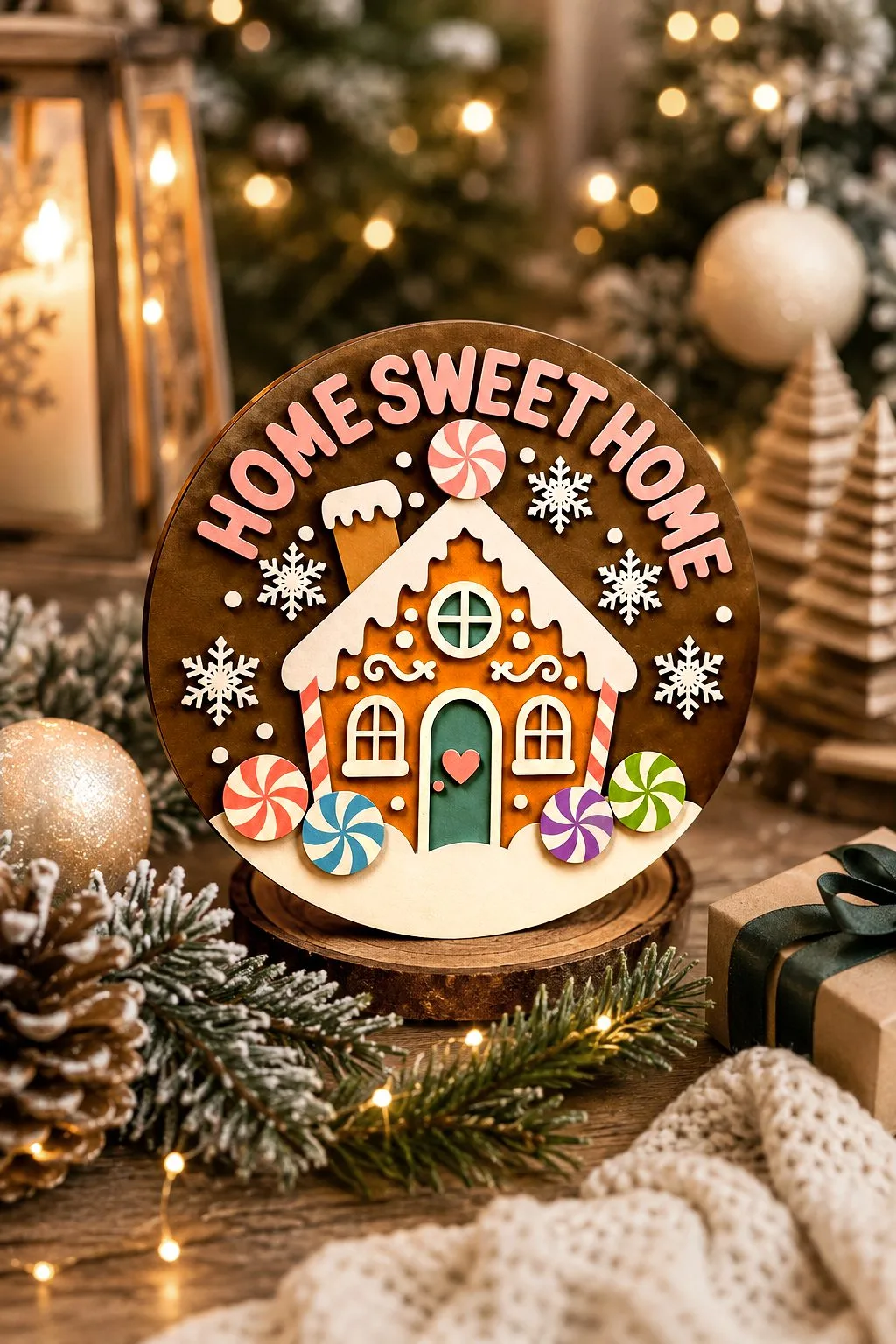
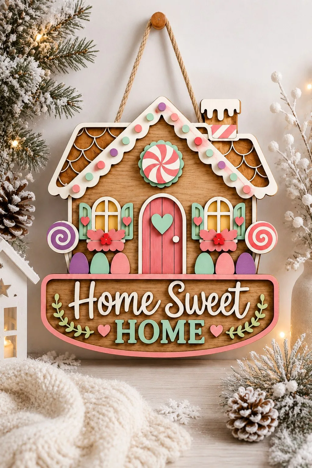
Two signs, three identical words, opposite decisions all the way down. Worth setting side by side before you cut either one.
The round one is dark brown, the colour of baked gingerbread, and it puts the phrase in an arc along the top edge. Every letter is a separate applied piece turned to its own tangent. That makes fifteen small parts, each with one correct position and one correct angle, and none of that will be obvious on the workbench. Cut a paper proof of the arc and glue on top of it.
Below the lettering sits a house with white icing scalloped along the roof and walls. It has a round window with a cross bar, two square ones, a green door with a pink heart and a chimney with a candy stick in it. Five candy swirls run along the lower edge, and a white snowdrift closes the bottom. Count the stack — backing, snow, house, icing, windows, door, candy, letters — and it is the deepest thing on this page, the one where a millimetre of drift shows.
The house-shaped sign
The house-shaped one follows the outline of the building itself and lays the phrase flat on a banner across the bottom, in two parts: Home Sweet in cream script, HOME in mint block capitals underneath, with small greenery sprigs at the ends of the banner. No arc, no fifteen angles. Two pitched roofs in natural wood have the shingle rows drawn in rather than cut. Cream icing spills over the chimney, and candy dots in pink, mint and purple run along the icing line. A peppermint swirl sits on a scalloped mint disc in the gable. Below are a pink plank door with a mint heart and two arched windows with amber panes and mint shutters. Flower boxes with small hearts sit under each window, a lollipop stands on either side, and a row of oval pastel candies runs along the base.
The real difference is not the shape, it is the palette. The round one reads as baked: browns, cream, a green door, a white snowdrift. The house is candy: pastel pink, mint, purple, white and natural wood, named outright by its maker. That is what lets the second one stay on a door through January, when anything red and green has to come down with the tree.
One small thing only the pastel house manages: the photograph has it hanging, on a cord over a wall knob. The fixing itself is still not visible, so plan your own — but at least somebody hung it before they took the picture.
Both ship SVG, AI, EPS, DXF, DWG and PDF, both list wood, MDF, plywood and acrylic, and neither states a thickness.
When somebody holds the sign
Let It Snow
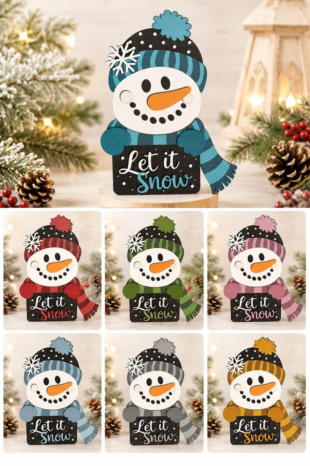
A different arrangement of the same problem. Instead of a phrase beside a character, the character carries the board. His mitten hands come over the top edge and pinch it, so the sign sits wedged between his arms rather than hanging underneath them. It is a small structural decision that removes a joint.
The head is a white circle with everything applied on top: an orange carrot nose, two cream cheeks, dot eyes and a mouth built from small black circles. The hat is black with a striped turn-up, a fluffy pompom and a white snowflake pinned to the side. The scarf has matching stripes and a fringed end.
The board itself is dark, and the letters are cut, not engraved — pale pieces standing on a dark shield, with Let it in white and Snow in the accent colour. That is the version of the trick that works on any phrase: make the shield dark, make the letters light, and you never have to think about contrast again.
Seven colourways, one cut
The photograph is the argument for the file. Seven colourways, one cut — teal at the top, then red, green, pink, blue, grey and mustard. Only the hat, the scarf, the mittens and the accent word change; the body, the face and the board are identical parts every single time. If you cut for a fair, one machine setup fills a table with things that look varied.
One caution, and it is ours rather than the maker’s: the maker calls this a door hanger, and there is no visible loop or cord hole in any photograph. In every picture the thing is standing. Plan your own hanging if you want it on a door.
Formats: SVG, AI, DXF, EPS, PDF, DWG. The maker spells out compatibility unusually fully: Glowforge, xTool, LightBurn, OMTech, Thunder Laser, Aeon Laser, Cricut, Silhouette Designer Edition, plus CNC routers that read SVG and DXF.
A Snowman Who Holds It Like a Placard

A snowman in a blue hat with a snowflake, blue mittens and a snowflake scarf waves with one hand and holds a small wooden LET IT SNOW board in the other. He stands on a flat base of his own.
Compare him with the seven colourways above. There the character wedges the board between both arms; here he holds it at the side, like a placard. The second version is easier to assemble, because the board attaches to one hand only. The maker says the layers come separate and the build suits beginners, and names craft fairs among the uses.
Formats: SVG, AI, DXF, EPS, PDF, DWG.
Let It Snow, Five More Ways
The same three words from five different makers, and five different answers to the question of where they should sit. Read together they work as a cheat sheet: decide where the piece will hang, and it becomes obvious which one to cut.
Two Layers and a Snowflake Lace
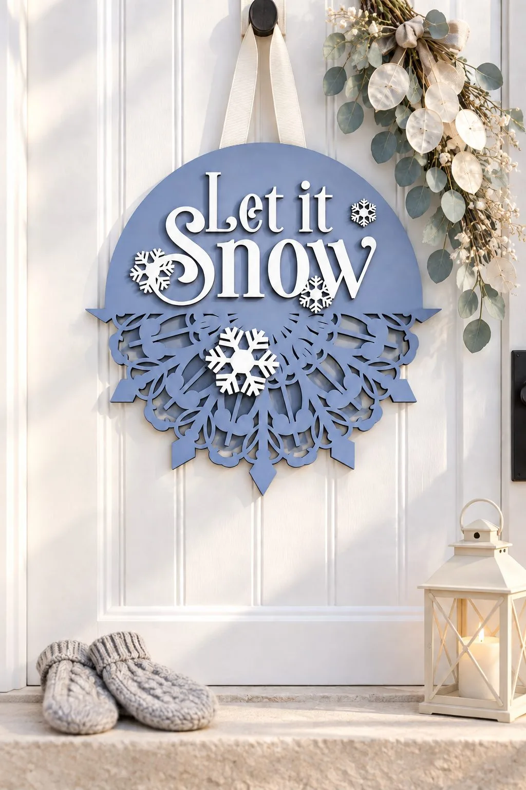
The simplest file in this section. The upper half of the round carries Let it Snow; the lower half is a lace of snowflakes that spills past the edge of the circle.
That is all there is. Two layers. The maker says it plainly: easy to cut and put together. If you have never made a layered sign, start here. The circle is 30 cm across, and the maker cuts it from 1/8 inch plywood, while noting that paper or cardboard will do as well.
Formats: SVG, PDF, DXF. Glowforge, CNC, Cricut Design Space, Silhouette Studio (Designer Edition only).
Script in a Circle

The same phrase with nothing layered on top: Let it Snow in a flowing script set inside a ring, with two snowflakes. This is not a door sign but a hanging piece — for a window, a tree or a door handle.
One thing matters here. Every letter holds on to its neighbour or to the rim. If you swap the font in your own version, check that each letter still touches something, or it will drop out when the laser finishes the cut.
Formats: EPS, SVG, PNG, DXF, PDF. Ready for print as well as for a cutter.
A Snowman in Earmuffs
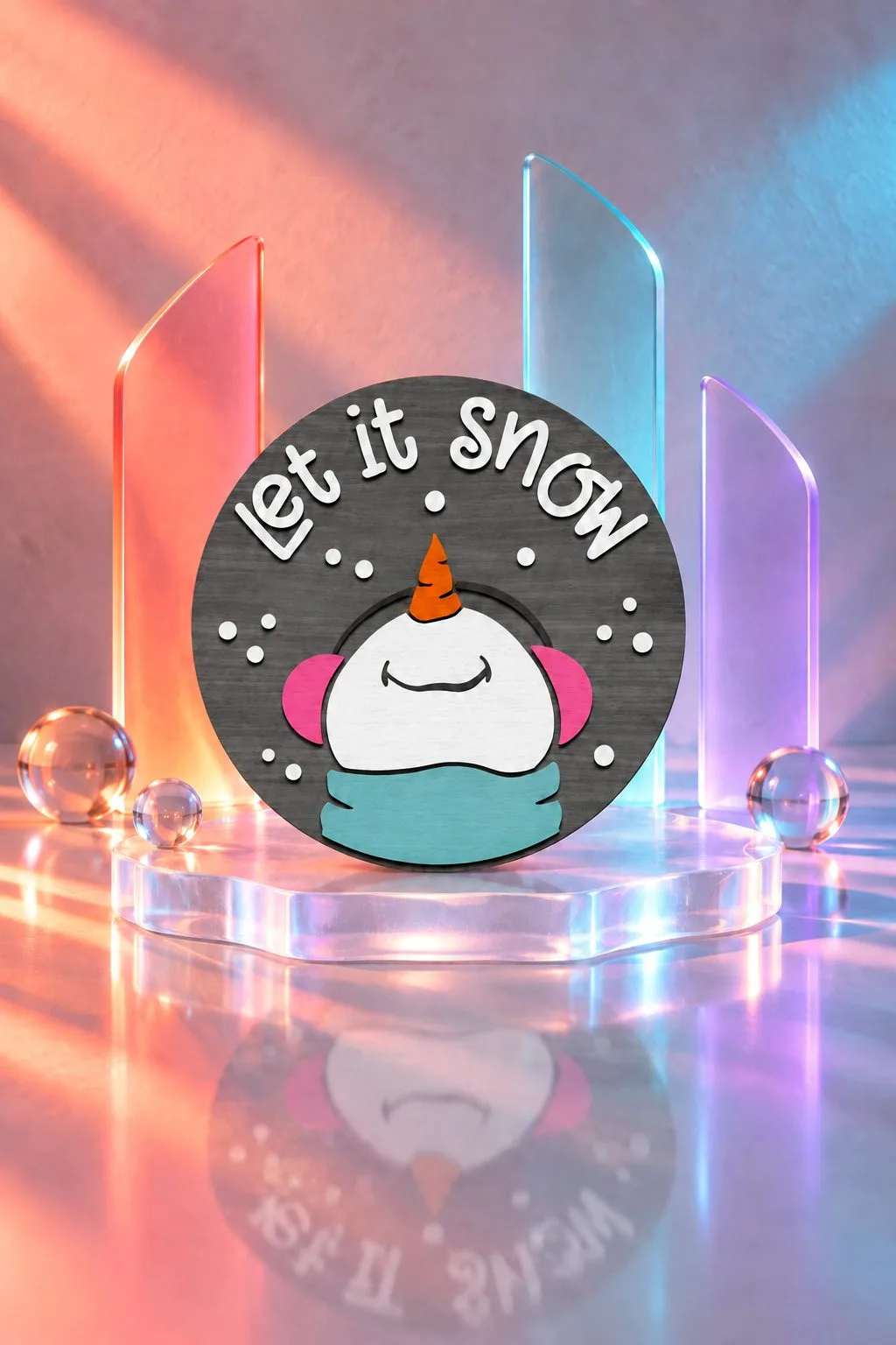
A dark grey round with let it snow arched across the top and, at the bottom, a snowman in pink earmuffs and a teal scarf — only the top of his face and the carrot nose show.
It is a good lesson in hiding a character halfway. The snowman peeks up from below, and the lettering gets the whole upper half of the circle to itself. The maker builds it in layers, and the watermarks and shadows in the photos are not in the files.
Formats: SVG, DXF, EPS, AI, PNG, PDF, JPEG. Cricut and Silhouette.
A Snowman in a Top Hat

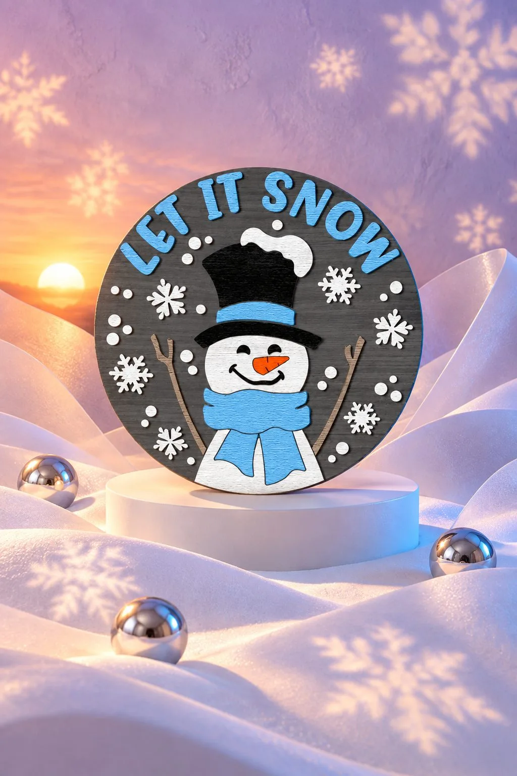
Same maker, different move: LET IT SNOW in blue capitals along the arc, a snowman in a black top hat and a blue scarf in the middle, stick arms, and snowflakes on a dark field around him.
The maker suggests one more place for it: the centre of a Christmas wreath. The round drops neatly inside a wreath, and then the sign becomes its middle rather than a separate thing on the door.
Formats: SVG (Cricut, Glowforge, Silhouette Designer Edition), DXF (Silhouette Basic), EPS, a layered AI, PDF, and PNG and JPG at 300 dpi.
Just the Face
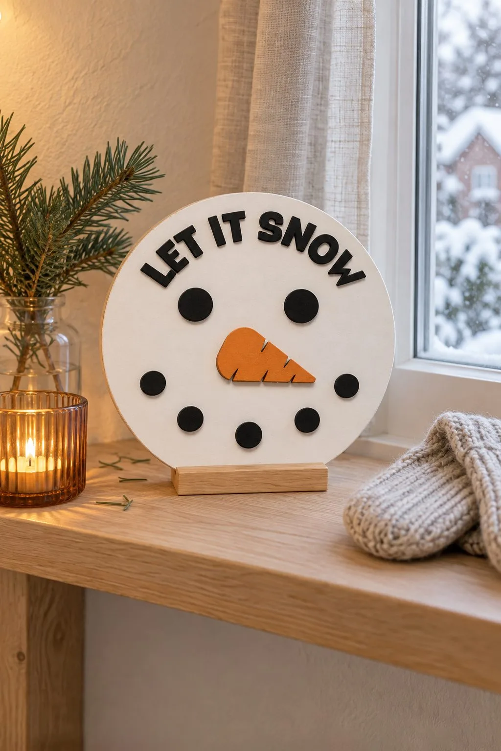
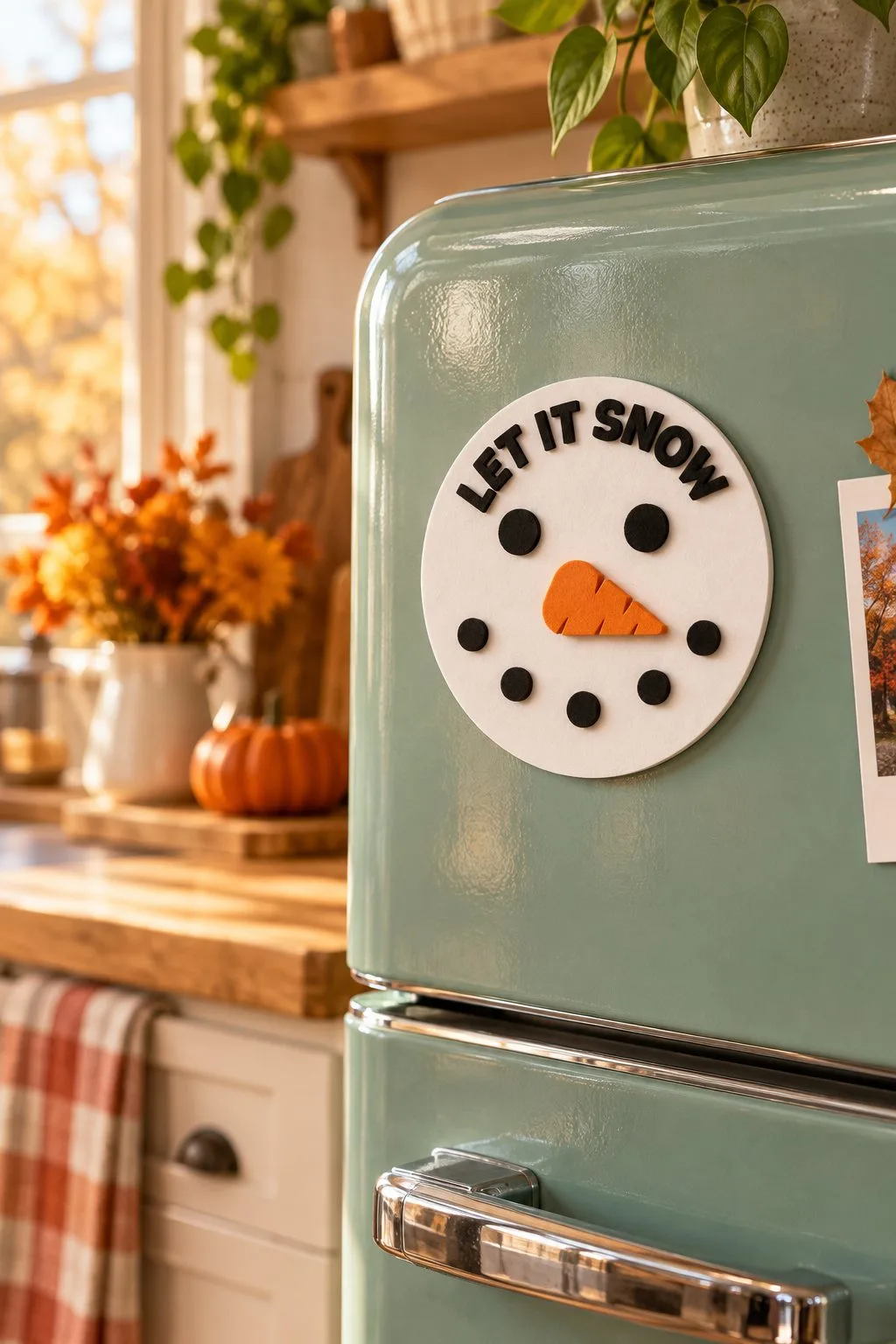
A white circle, black coal eyes, a carrot, a smile made of dots and LET IT SNOW arched across the top. No hat, no scarf, no background.
It is the smallest piece in this section — 12.7 × 12.7 cm — and the second photo shows why that size makes sense: it works as a fridge magnet. One file gives you a sign on a stand, a magnet, an ornament and a tiered tray piece. The maker writes openly about small businesses.
Formats: SVG, DXF, EPS, PDF, PNG.
When the word is the object
Two Words That Stand

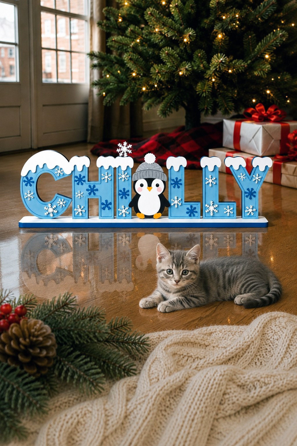
Here the lettering stops being decoration on an object and becomes the object. Two makers, no connection between them, the same idea arrived at twice — which is the best reason to trust it.
WINTER is six thick letters in grey-blue and white, each wearing a white snow cap cut to follow its own top edge. The T is a snowman — blue hat with a pompom, scarf, carrot nose, buttons — standing exactly as tall as the letters and slotting into the word without breaking the line. Snowflakes of different sizes lie over the letters as overlays.
CHILLY does the same thing in pale blue with a penguin in place of one letter, snow caps along the top, small snowflakes over the fronts, all on a base plate.
What holds the letters together
The part worth understanding is at the bottom of both. A white wavy snowdrift runs under every letter and joins them into a single piece. It looks like scenery. It is structure: without it you would be gluing and aligning six separate glyphs, and any one of them out of true would be obvious at a glance. The drift also carries the tenon that drops into the base plate.
Steal this. Any word you want to cut standing, give it a ground strip — it turns a fiddly assembly of separate letters into one part. And swap one letter for a character whose silhouette is close to it: the snowman for a T, the penguin for an L. It reads as a word and as a scene at the same time, and it costs nothing extra to cut.
WINTER ships as a single design with its base included. Formats: SVG, DXF, AI, EPS, PDF. Machines: Glowforge, xTool, LightBurn, OMTech, Thunder Laser, Cricut. The listing gives no thickness or dimensions.
CHILLY and its folder of twenty-five
CHILLY is not sold alone. It is one design out of a folder of twenty-five. The maker lists Santa in several versions, snowmen, a Welcome Winter, gnomes, deer with fir trees, penguins, gingerbread houses, cardinals, a Let It Snow, an elf family with Mrs Claus, a Christmas truck, a sleigh and a winter village. Twenty-five designs, and the number is stated rather than implied — worth more than it sounds, because bundles that only promise “20+” leave you finding out what you bought after you have bought it. All of them come with layered bases.
Two things in that spec are unusual. The material list includes heavy cardstock alongside wood, MDF and acrylic, so some of these will cut on a paper machine. And the maker aims openly at fairs and at reselling finished pieces, which is the honest framing for a folder this size: it is stock, not a project. Formats: SVG, DXF, DWG, EPS, AI, PDF. Machines: Glowforge, xTool, OMTech, Mira, Cricut, Silhouette Cameo, LightBurn and CNC.
Things that stand
A Deer That Lies Down
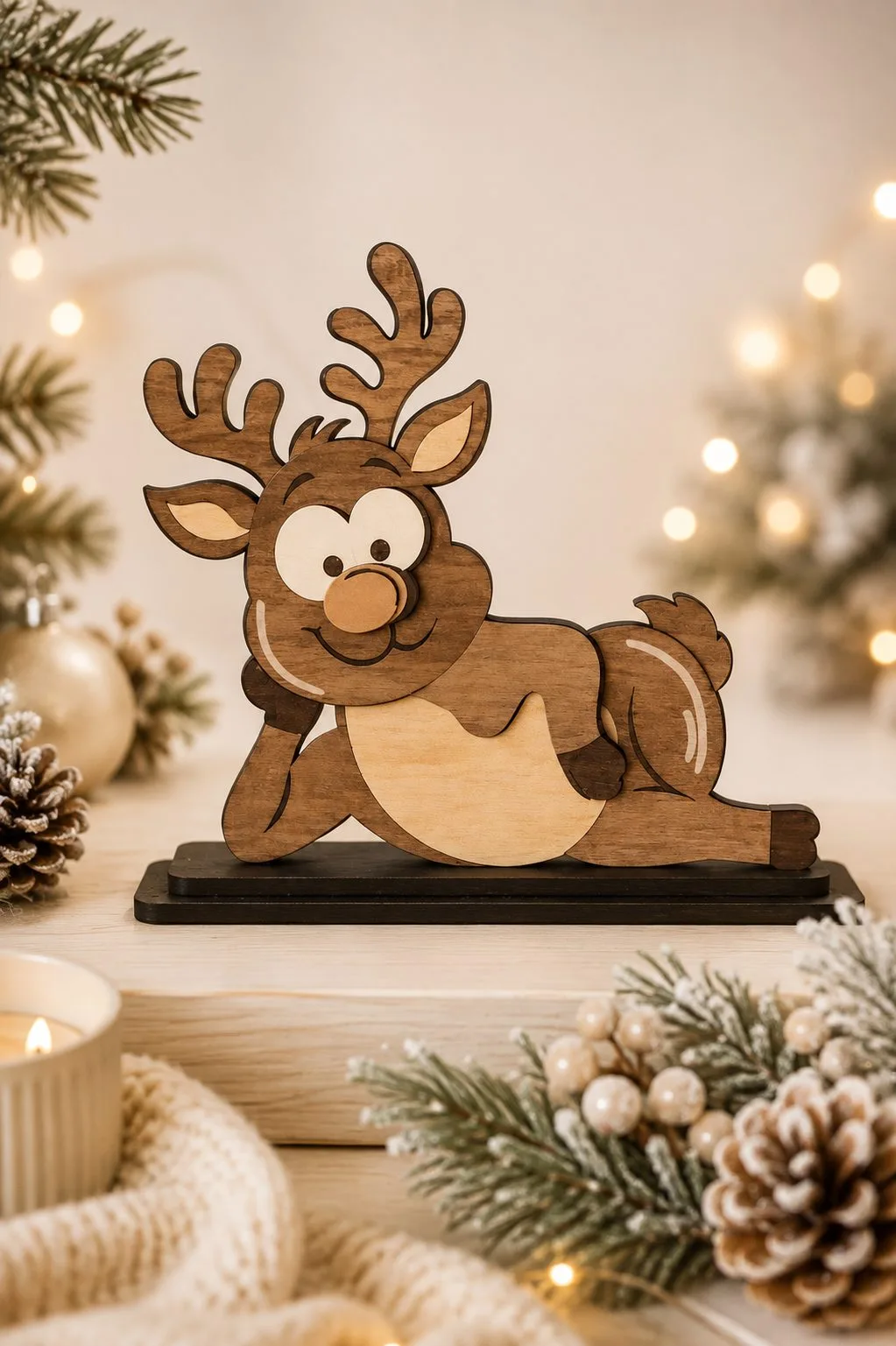
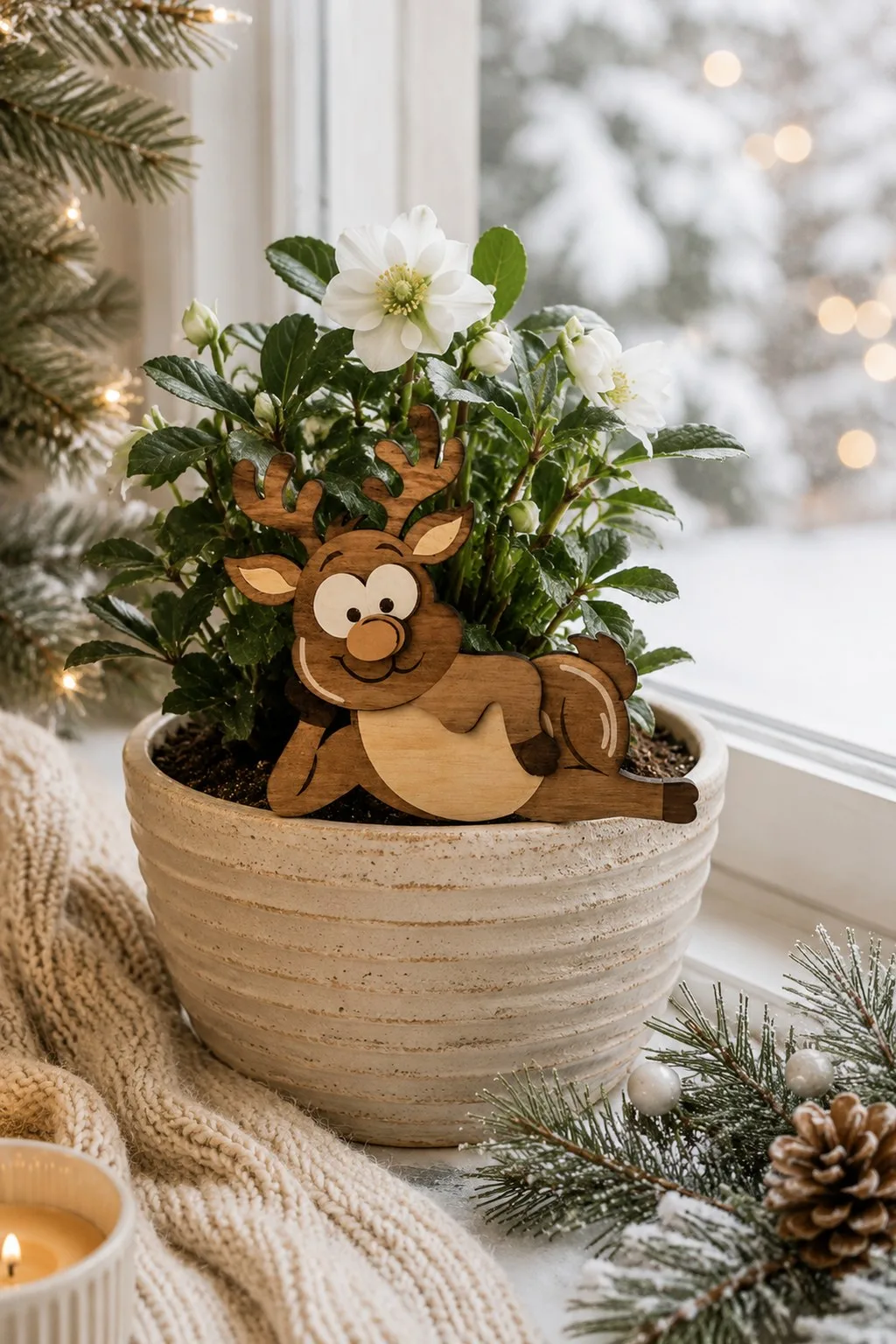
Almost everything in this round-up is vertical. This one is not, and that is its whole argument: a lying deer sits on a windowsill or a narrow shelf where an upright figure has nowhere to go.
The deer lies with its front legs stretched out and its head propped on them, one back leg tucked aside. There is no paint anywhere. The colour comes from using different shades of plywood. A dark body carries pale overlays for the belly, the muzzle and the insides of the ears, with white eyes, dark pupils and a round nose. The figure slots into a dark rectangular base and stands on its own.
The antlers come as one piece with the head and stick up above it. That is the fragile part. The maker states the required thickness outright: 3 mm — and at three millimetres, branching antlers are the thing that snaps, in the machine or on the way to the shelf. Handle by the body.
The second photograph answers a question the maker never does: how big is it. The listing gives no dimensions anywhere, but here the deer sits in a plant pot with room to spare. That is the scale to plan around before you scale the file up.
The maker also says plainly that the photographs are for inspiration only, so treat the pictures as a suggestion of finish rather than a promise. One design in the archive, stated. Formats: SVG, DXF, EPS, PDF, JPEG, PNG.
Santa and a Reindeer That Stand on Their Own
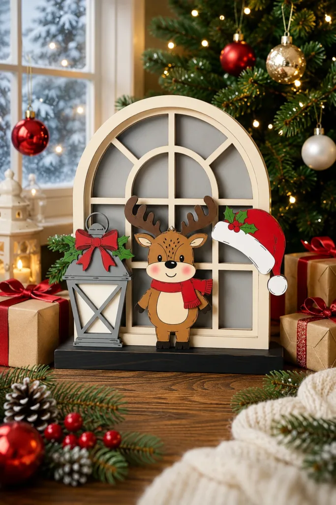
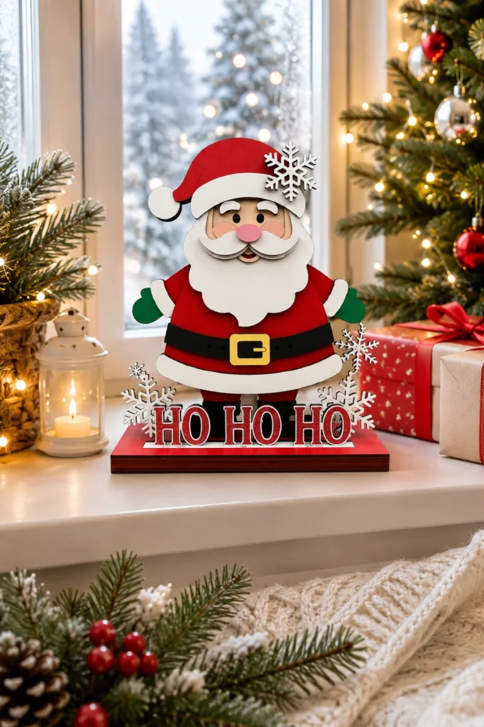
Two more from the same 25-design folder as CHILLY above. A reindeer in a red scarf stands beside a lantern in front of an arched window frame, with a Santa hat on its corner. Santa stands on a red base that reads HO HO HO. Both come with layered bases, so they sit on a sill or a shelf without leaning on anything.
The folder holds 25 complete designs. They include several Santas, snowmen and a Welcome Winter, gnomes, reindeer and tree scenes, penguins, gingerbread houses, cardinals and Let It Snow, an elf family with Mrs Claus, a truck, a sleigh and a winter village. Formats: SVG, DXF, DWG, EPS, AI, PDF, for wood, MDF, acrylic or cardstock.
A Boy With a Sled on His Own Base
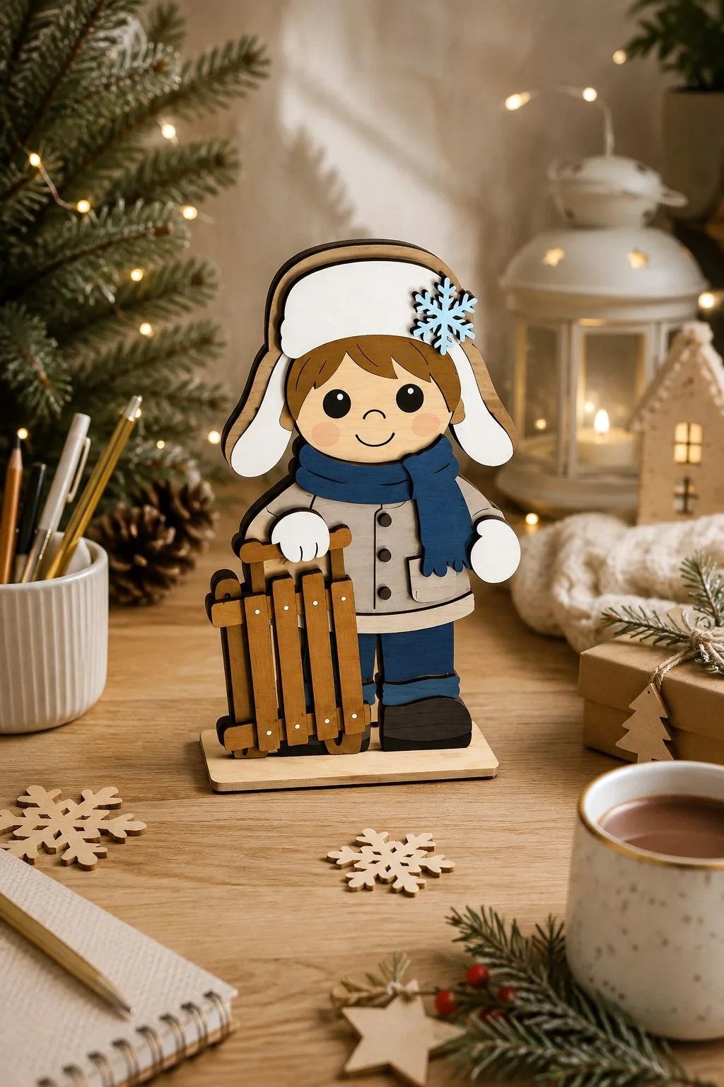
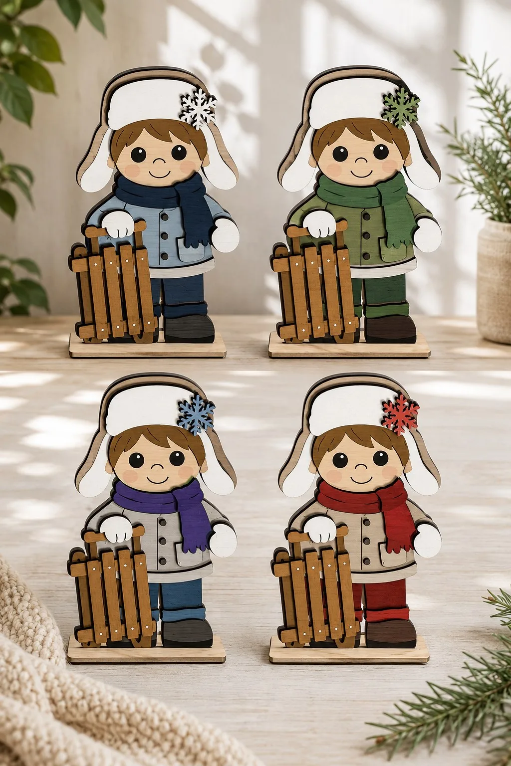
A boy in a white trapper hat with a blue snowflake on the side holds a wooden sled in a white mitten. He wears a blue scarf with a loose end and a grey coat with three buttons and a patch pocket. The sled is the busiest part of the file: a seat of five slats, a curled runner and pale round rivets. Without it he is just a boy; with it the whole winter scene is there.
The base is a separate piece, and the maker says so: the figure drops into a slot in a plain rectangular stand instead of balancing on cut-out feet. That matters more than it sounds, because a plain base takes whichever figure you slot into it. The second photo shows the same boy in four colourways, blue, green, purple and red. Plywood, MDF or acrylic; SVG, AI, DXF, EPS, PDF and DWG. The listing gives no thickness or height, so check the slot against your sheet before cutting.
Tis the Season for Snowflakes
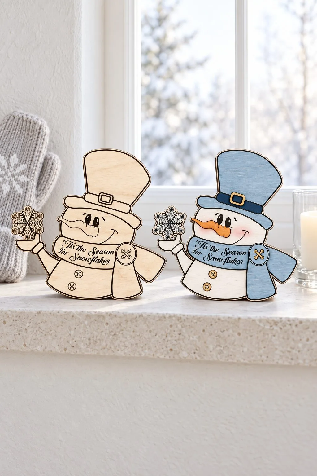
A snowman in a top hat holds up a snowflake, and Tis the Season for Snowflakes runs across his belly — a play on ’tis the season to be jolly.
The photo makes the useful point: the same figure in bare wood and painted. The engraving already reads as finished on natural wood, so paint here is a matter of taste rather than a necessity.
Formats: SVG, JPG, EPS. Thickness not stated.
Winter sign layouts at a glance
| Layout | Examples | What it gives you |
|---|---|---|
| Words on their own band | Snuggle Up Gnomies, Hello Winter, Snowy House | Lettering that reads from the pavement, even with several typefaces |
| Bare wood behind the letters | Warm Winter Wishes, Winter Wonderland | A shallower stack and a shorter cut list than a painted round |
| A snowdrift or ledge across the circle | Penguin, Reindeer, Three snowmen | The body is never drawn, and the words get an empty field |
| A picket fence | Gnome behind a fence, Smiling snowman | The fence hides the join and holds mittens or a boot |
| One rim, many fillings | One Blank, Six Signs | The same cut list and hanging hole for six designs |
| A character holds the board | Let It Snow, Snowman with a placard | One joint fewer; the placard version is the easier build |
| The word is the object | WINTER, CHILLY | A drift under the letters joins them into one part |
| Lettering on an arc | Home Sweet Home, Winter Wonderland | Fifteen or sixteen small pieces, so cut a paper proof first |
What to know before you cut
Thickness is stated in six files out of twenty-nine. The two-layer Let It Snow round calls for 1/8 inch plywood. The deer needs 3 mm and says so. Both the smiling snowman and the gnome give 3 to 6 mm. The six-sign bundle asks for 3 mm ply, MDF or acrylic, and the three snowmen of Let It Snow give 3 mm (1/8 inch) plywood, MDF, basswood or acrylic. Everything else leaves it to you. For flat layered work that is genuinely fine, because a sign is glued face-on, not slotted. But the moment a design has a tenon dropping into a base, as the WINTER sign does, the slot follows a thickness somebody had in mind. Measure your sheet and check the slot width in the file before you run it.
Lettering is where these files are won or lost. Maker after maker here solved the same problem the same way: put the words on their own band of background. Script on a pale stripe, block letters in white, a banner behind the small line. If you take one thing from this page, take that.
A snowdrift is a part, not a decoration. On both standing words, the wavy white strip along the bottom is what holds the letters in one piece. When you design your own, draw the ground strip first.
Cutting and hanging
Cut arcs on paper first. Two signs here bend their lettering around a curve: Home Sweet Home, fifteen small pieces on fifteen different angles, and Winter Wonderland, sixteen. A paper proof under the glue-up turns an afternoon of squinting into twenty minutes.
“Door hanger” is a name, not a fitting. Several of these call themselves door hangers and show no hanging hardware in any photograph. A handful hang in their photographs: the Winter Wonderland snowman on a rope over a wall hook, the penguin and the gnome on a twisted cord. But in none of them can you see what the cord is actually tied to. If it needs to hang, plan the loop yourself.
More winter
If you want the tree rather than the door, the companion piece on ornaments takes thirteen bundles apart the same way: Christmas Ornament SVG: 13 Laser Cut Bundles, Design by Design.
And every winter file we have gathered, with a picture of each and a direct download, lives on one page: Winter Decor Ideas — free winter SVG laser cut files. It is worth a look even if you came here for one sign; the shelf sitters in particular photograph badly at thumbnail size and are better than they appear.
Can’t find the design you need?
Describe your idea in a few words and generate your own SVG design with AI.
Good to know: the files in this guide are hosted on Creative Fabrica. Downloading is free with their free trial: a payment card is needed to start it, and you can cancel the subscription at any time.